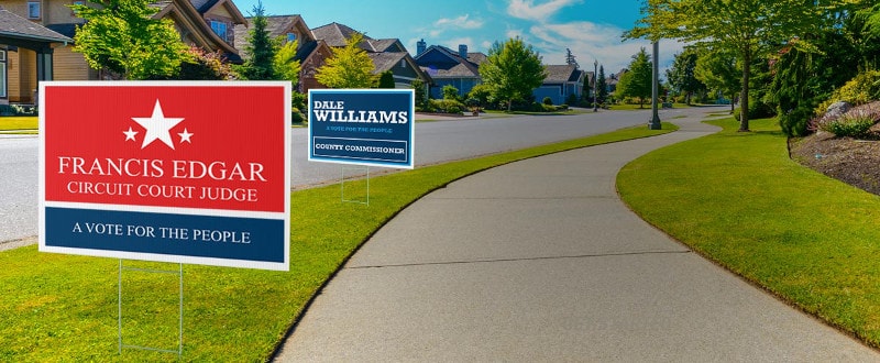
What is the purpose of your lawn signs? This will determine what type of information you should put on your lawn sign. It is very tempting to put too much info on these type of signs. Take a moment and decide what the main purpose for your yard sign is. You should have a main point that is large and bold, then a second focus that is a little less dominant. For example, if your sign is for a garage sale, you would want sale to be big and bold and then the address and phone number less dominant.
People generally tend to want to put too much info on lawn signs. You must keep in mind these are typically being viewed by traffic rushing by. You should consider the speed limit of the road you are posting your signs on. Typically, on highways you only want 1 or 2 main points, anything more will require shrinking the text to fit it all and drive by traffic will not be able to read it. If you are placing your signs in your front yard, you will be able to add a little more info as traffic will be passing by at a much slower speed or even just walking past.
A lawn sign is not the place to put info about your company, lots of details about an event, etc. The best thing to do if you have a lot of info to convey, is to put your item you are advertising big and bold and then add your contact info below, in a clear easy to read font with high contrast colors. So show your event and then add a phone number they can call for more info, or website they can visit for more info. The same thing applies to selling a product or service, list the item in big bold letters, then add contact info below in bold, clear letters.
Color is another thing to consider when designing your yard sign. High contrast colors are your best options, with black and white being the highest contrast. White with any other color except maybe yellow is also a good option. You can also use complimentary colors such as blue and orange, green and yellow, or red and blue. Some combinations are harder to read from a distance such as black with most colors, unless you make them lighter or neon, for example black and neon green would be a high contrast combination while dark green and black would be difficult to read.
If you keep these items in mind, your lawn sign will be easy to read and hopefully alert all the passing by traffic of your sale, event or offer. Yard signs are an inexpensive way to advertise and have a great return on investment.


