You may asking, ‘what is a typeface?’ and that’s a wonderful place to start. A Typeface is simply a font family, or series of fonts that share similar weight, shape and general characteristics. Make no mistake, your campaign’s typeface can be incredibly important to your campaign theming and message. For evidence of this, we turn back to the then-Senator Obama’s 2008 presidential campaign.
Unified Vision with a Unified Typeface
Imagine a dozen different campaign mediums. You have your flyers, your roadside signs, banners above great big entrances, cars with bumper stickers, and numerous other printed media. When we produce media like this for a campaign big or small, we should expect to find a common thread throughout them all, an element that unifies the vision regardless of what format it’s being displayed from. The most obvious answer is fonts.
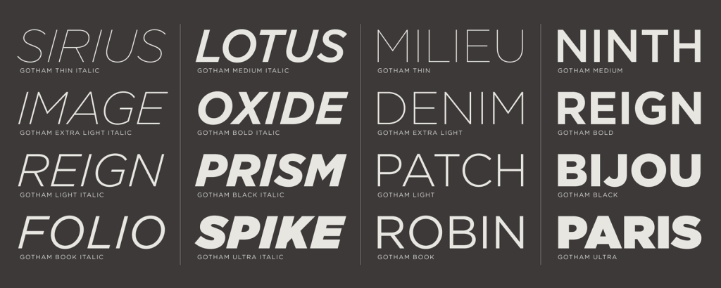
The design team in Obama’s 2008 run eventually turned to well-known typeface Gotham, created by Johnathan Hoefler and Tobais Frere Jones. Gotham gave the campaign a strong, masculine feel after having been designed from New York Port Authority Bus and Terminal signage. The Typeface offered flexibility, but strength in the boldness of its characters and softness in the gentle sloping angles of its character design.
Secondary Typeface
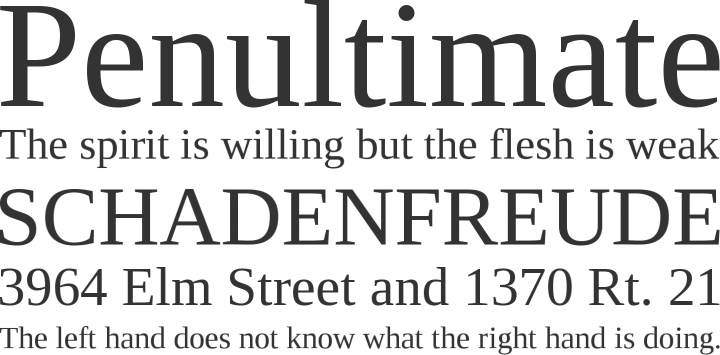
In addition the main font, the Obama team chose secondary fonts, Liberation Serif for body text (seen above) and Snell Roundhand for special text elements. These secondary fonts were important because they gave the campaign a strong historical influence in all of their designs. As we’ve discussed in previous articles, for Senator Obama to overcome challenges of inexperience his team worked feverishly to promote Obama’s campaign as ‘presidential’ and ‘historically American’ to overcome the conscious belief American’s held.
Tying Design to Typeface
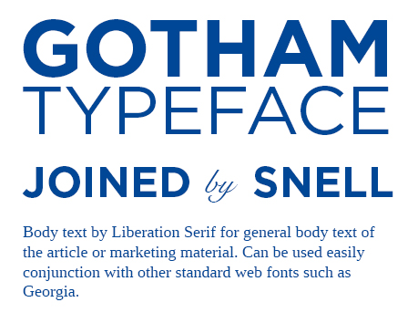
It wasn’t the individual typefaces that impacted the American people however, it was how they were used in conjunction to one another. A loose set of guidelines were created for the fonts and an organizational pattern emerged as the campaign progressed. Here we can see the visual guidelines Obama’s campaign used to focus their message, Gotham used in various font weights and fully justified creates a bold look that’s always symmetrical and in all caps. Snell Roundhand often used to connect key phrases and words, such as ‘to’, ‘from’, ‘by’. Lastly, Liberation was used in the text body. Tying these design elements together created a more powerful message than could ever be accomplished alone.
Your Typeface
So how does any of this help us? When we talk about campaigning, we cannot forget your message is the most valuable aspect of that campaign and the medium we share this message is as important as the typeface you pick. Ask yourself, is the font family you’re working with really communicating your message? Can you see the public associating this font with your campaign ideals? If the answer is no then worry not. There are resources out there to discover more yourself, or get professional help from designers such as the ones at Speedy Signs USA.


